Context & Problem
OTA Sync (now Hotel Sync) is a property management system for hotels and short-term rentals. By v1.0, the Settings module was structurally broken in three ways: navigation was a flat unsorted list of 13+ items, General Settings was a single endless form with everything expanded simultaneously, and Rooms/Extras were merged on one screen despite being completely unrelated. New hotel managers were overwhelmed during onboarding, driving up support volume and slowing activation.
Before: Settings Navigation 1.0
Entering Settings dropped the user directly into a flat list sidebar: no grouping, no visual hierarchy, no entry screen. Every item was equal weight. Users had no mental model of what each setting domain contained or where to start.
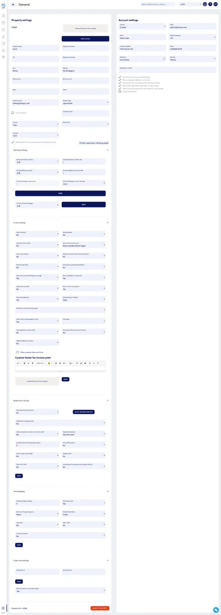
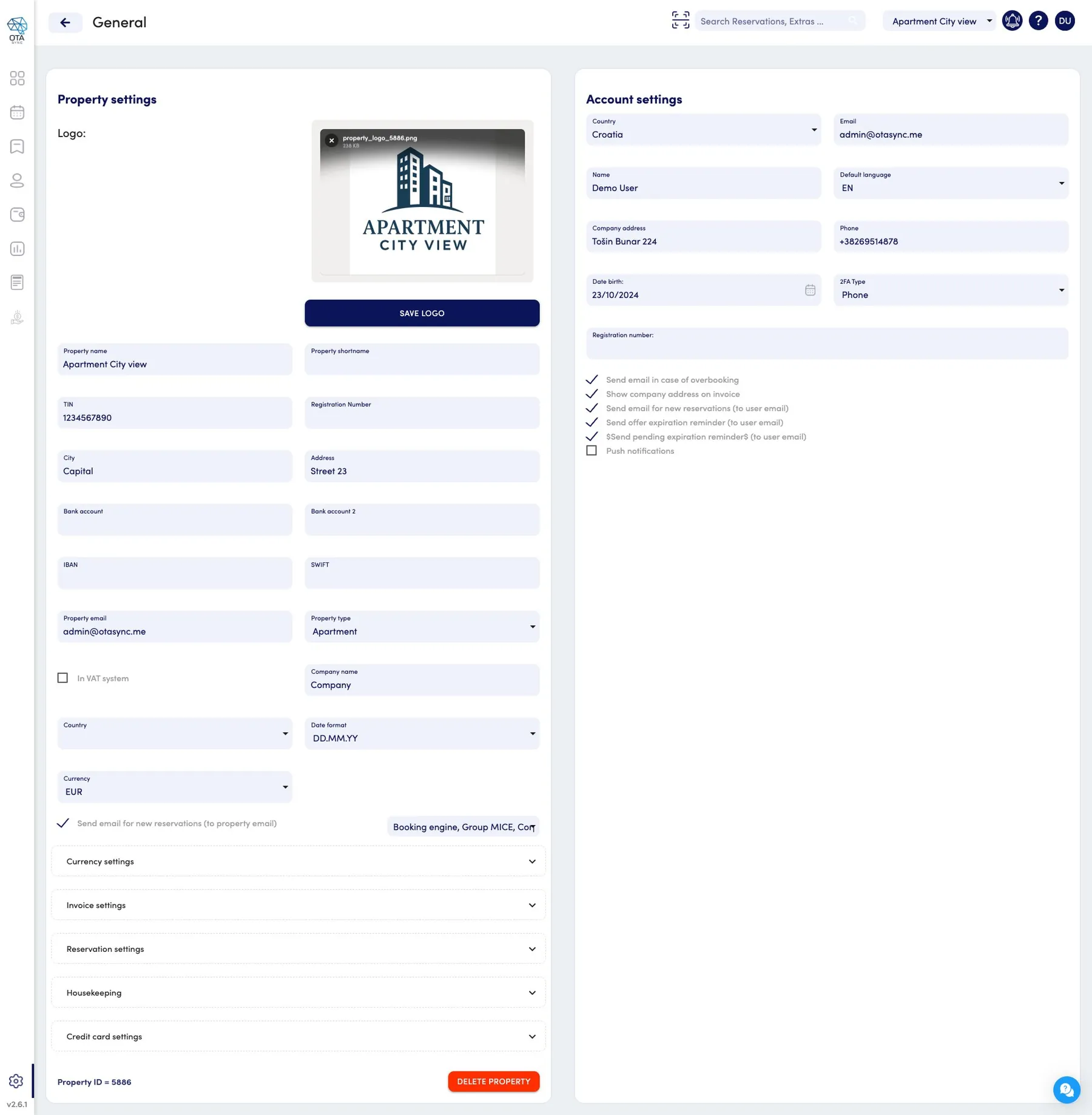
Before: General Settings 1.0
General Settings was a single page with every section expanded at once: Property info, Currency settings, Invoice settings (with rich text editor), Reservation settings, Housekeeping, and Credit card settings all stacked in one continuous scroll. No section separation, no progressive disclosure, multiple Save buttons scattered throughout.
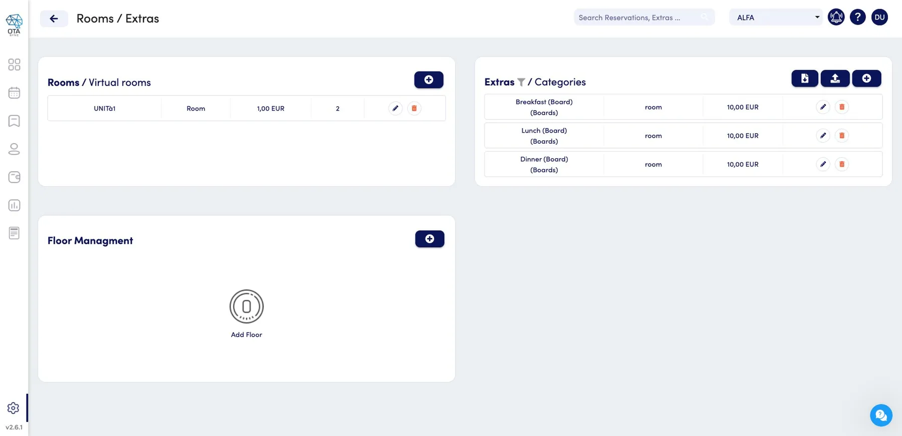
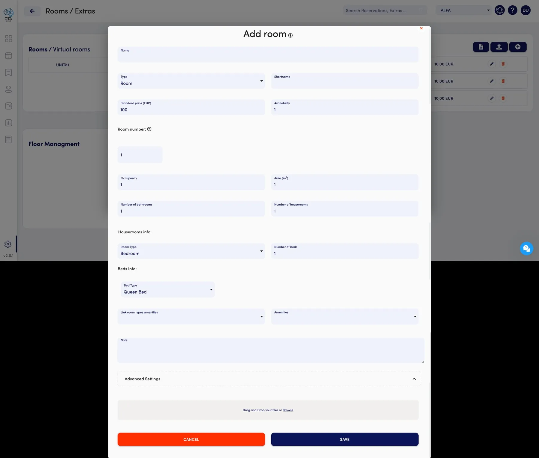
Before: Rooms & Extras mixed, Add Room 1.0
Rooms and Extras (meal boards, add-on services) were shown on the same page split into panels: conceptually unrelated things combined for no clear reason. Adding a room opened a long modal form with no tabs: all fields from name and type down to housekeeping info, bed configuration, amenities, and notes in one vertical scroll.
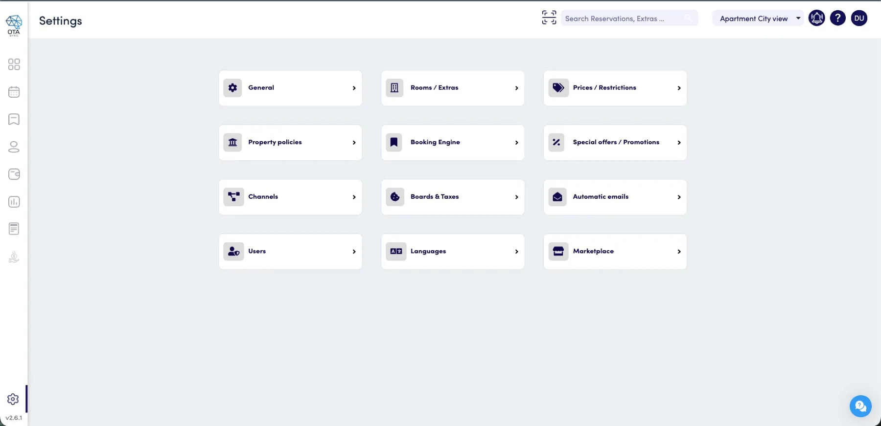
After: Settings Navigation 2.0
Settings now opens to a structured card grid: 12 domains, each with an icon and clear label, grouped visually by row. Users immediately understand the full scope and can navigate directly to what they need.
After: General Settings 2.0
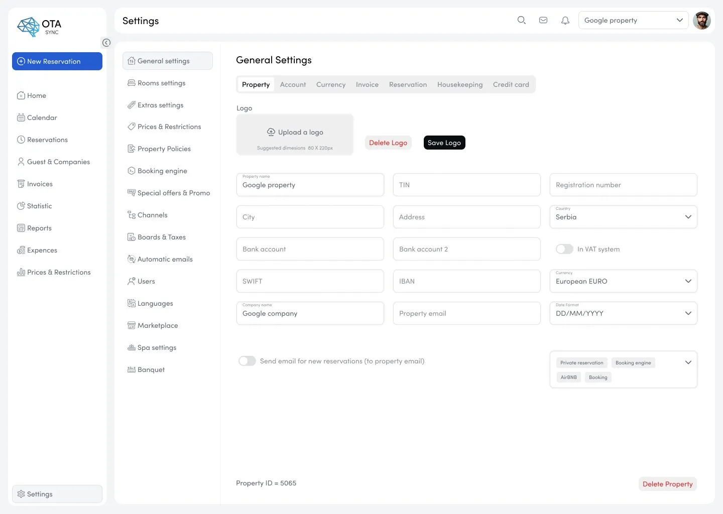
General Settings is now tab-navigated: Property, Account, Currency, Invoice, Reservation, Housekeeping, Credit card, each a separate screen. One domain at a time, one save action per tab. No scroll across unrelated sections.
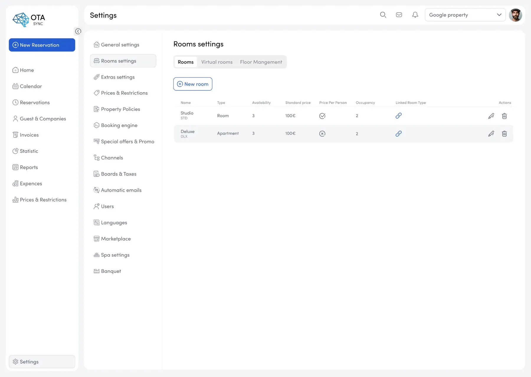
After: Rooms separated, Add Room 2.0
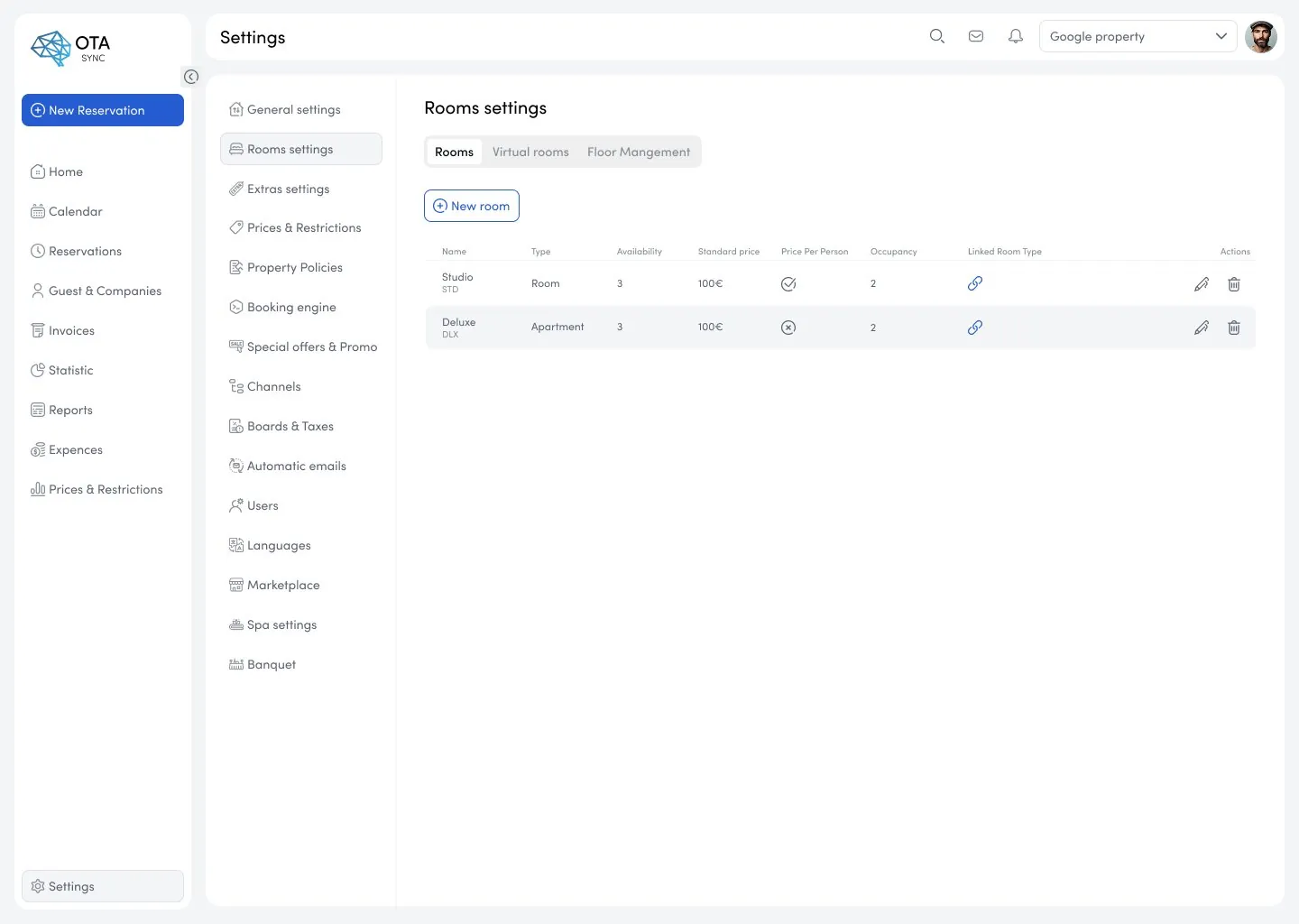
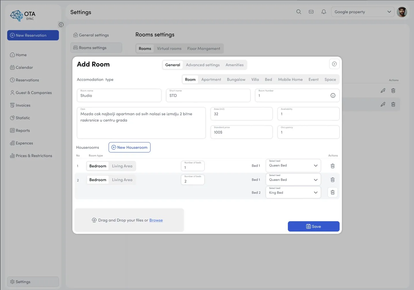
Rooms and Extras are now fully separate modules. Rooms settings has its own tab structure (Rooms / Virtual rooms / Floor Management). Adding a room uses a tabbed modal (General, Advanced settings, Amenities), dramatically shorter per tab, with accommodation type selector and houseroom configuration clearly organized.
The pattern applied across the system
Settings was the proof case, not the whole job. The same three moves (a card-grid entry point, tab-per-domain inside each module, one save action per tab) were rolled out across every configuration surface in the product. Once the pattern held, engineering could build new settings modules without a design ticket, which is the point of a pattern library rather than a set of screens.
My Role
End-to-end product designer across web, mobile, and client-facing applications. Aug 2022 – Jan 2024. Responsible for discovery, systems architecture, UI redesign, pattern library definition, and ongoing implementation feedback during the v2.0 rollout. Primary design voice throughout the 1.0 to 2.0 evolution.
Approach
- Audited all 40+ forms and configuration screens: mapped every user task to required steps
- Identified 12 core interaction patterns used inconsistently across the product
- Replaced flat settings sidebar with a structured card grid entry screen grouped by domain
- Redesigned General Settings from a single endless form into tab-per-domain navigation
- Separated Rooms and Extras into independent modules with clear scope boundaries
- Redesigned Add Room from a long scroll modal into a tabbed modal (General/Advanced/Amenities)
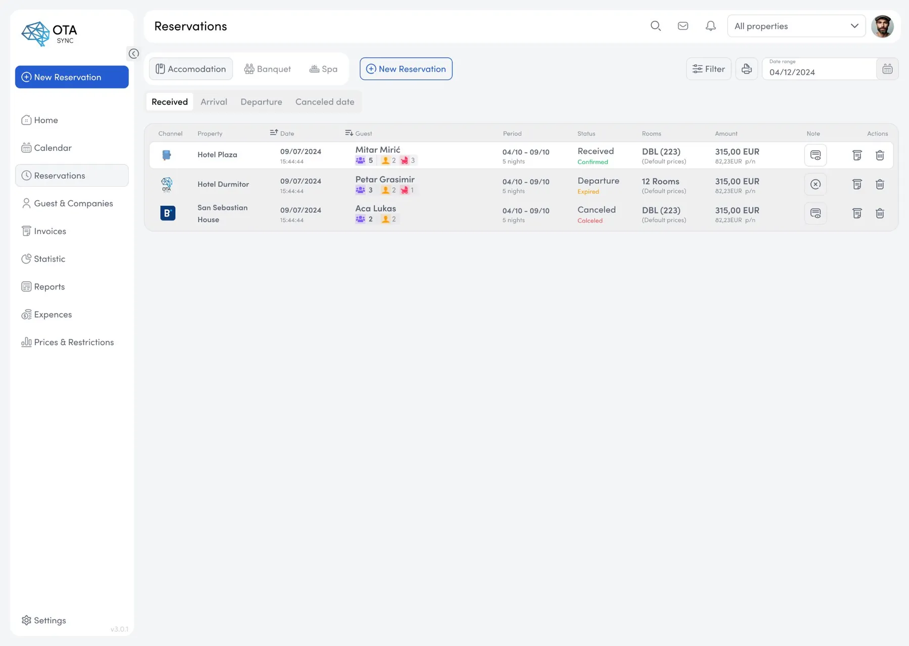
- Simplified new reservation creation workflow from 9 steps to 4
- Built a modular component system and pattern library used directly by engineering
- Embedded in the implementation cycle: async feedback on shipped code, not just handoff
Booking Engine: Guest-facing Product
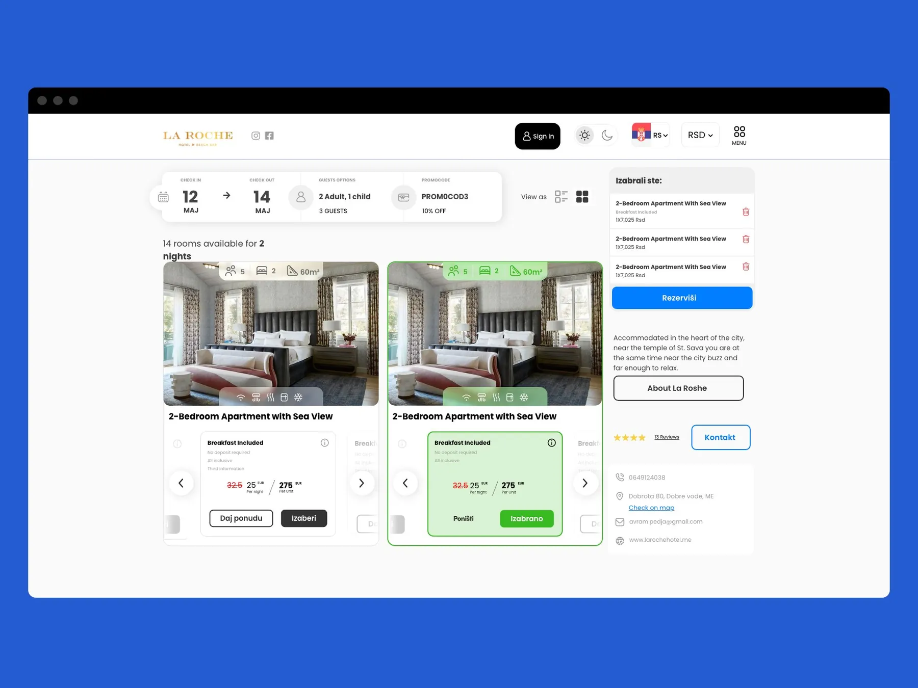
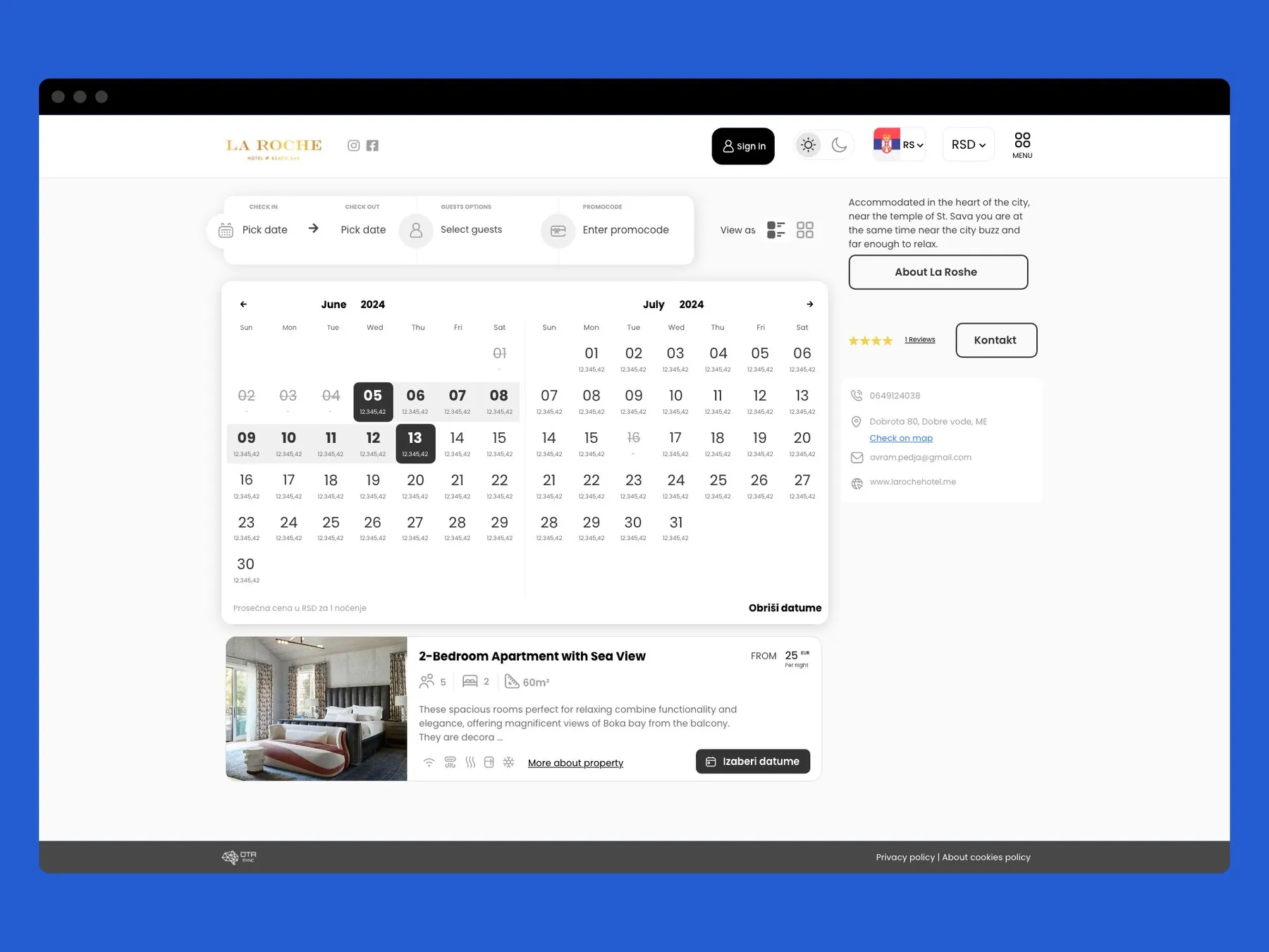
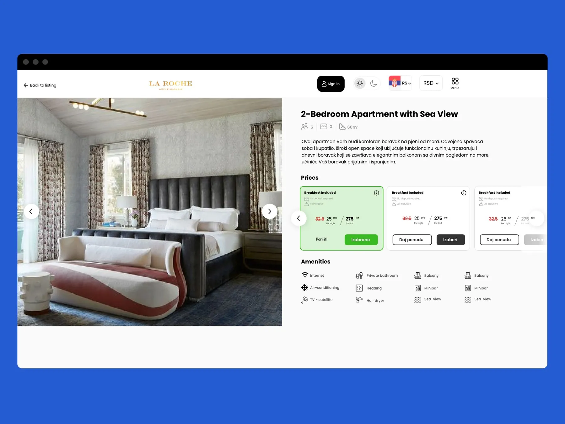
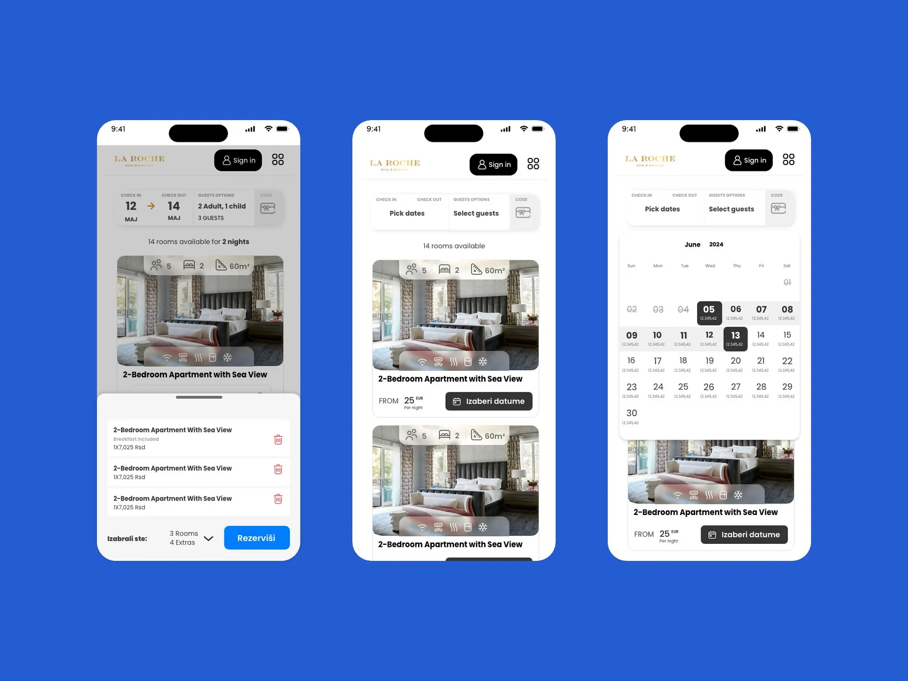
In addition to the PMS back-office, I also owned the design of the guest-facing Booking Engine: a white-label reservation widget deployed on hotel websites. This required designing for two distinct audiences: hotel managers configuring the product, and guests completing bookings on the frontend.
Mobile App: Hotel Manager iOS App
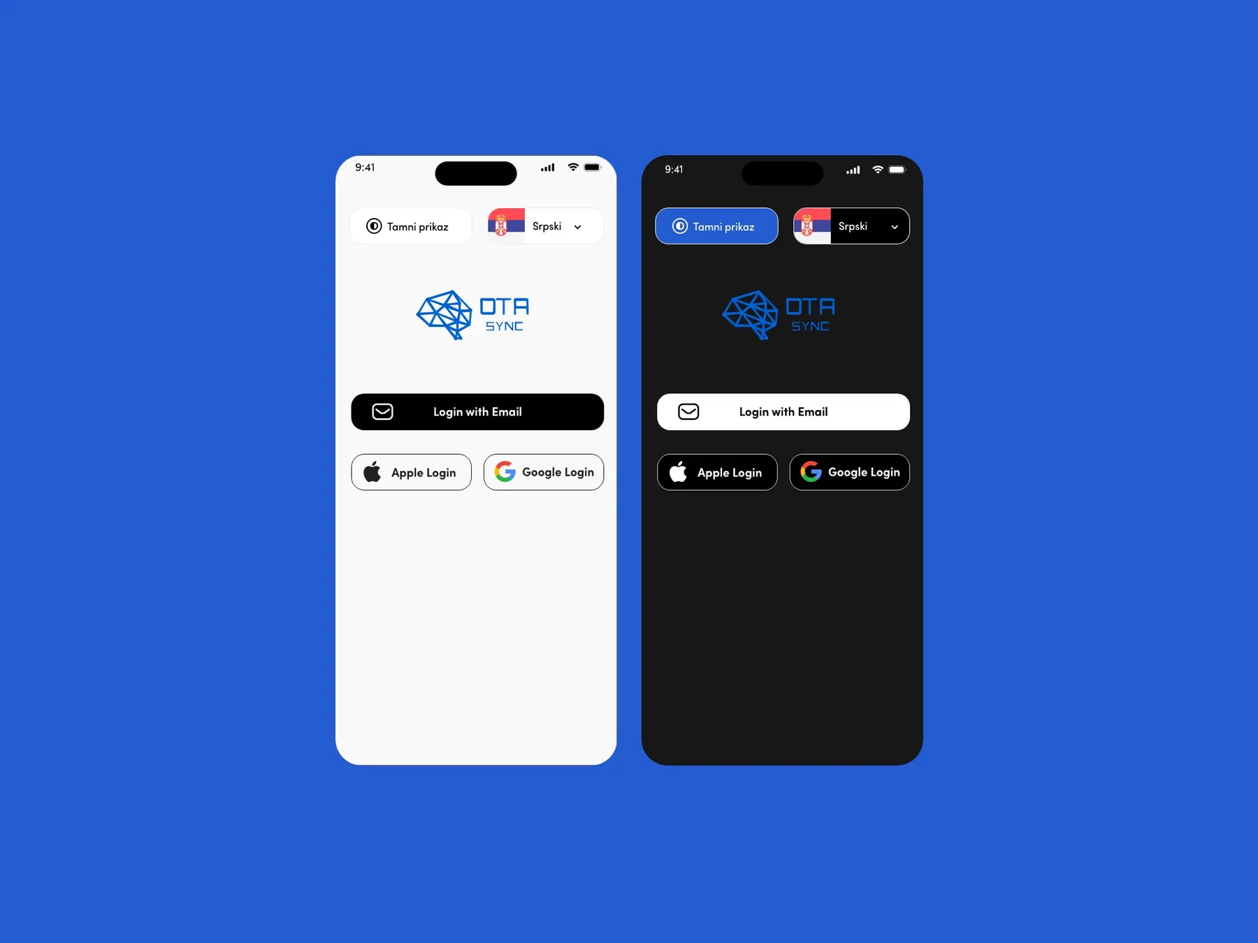
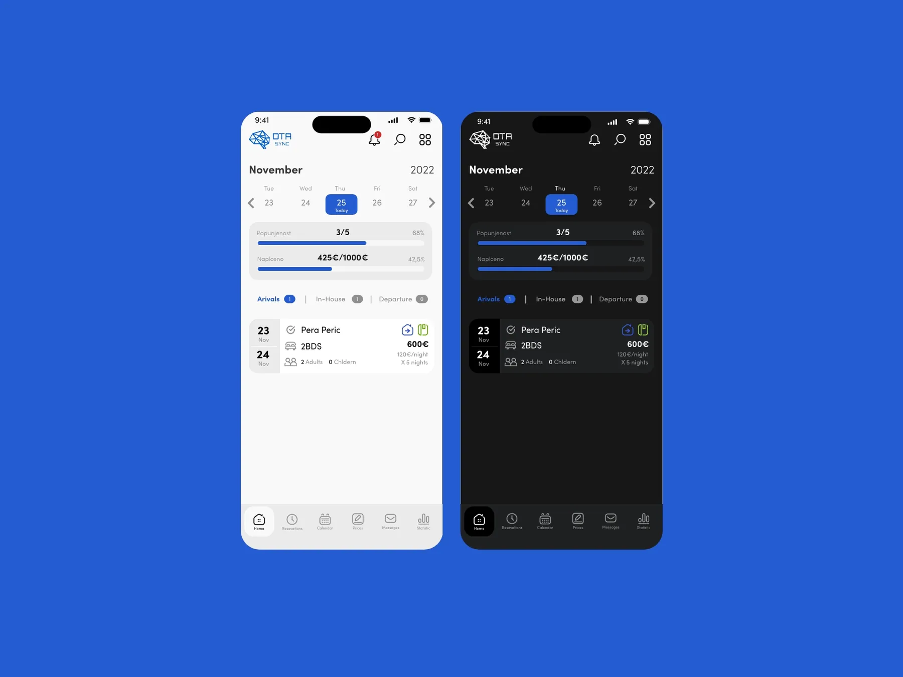
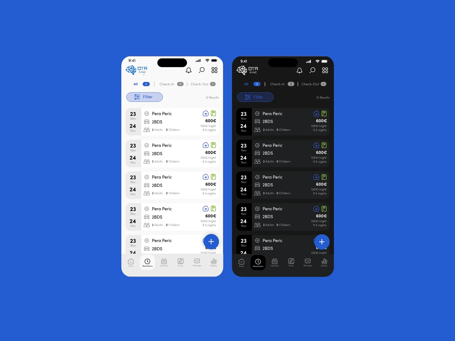
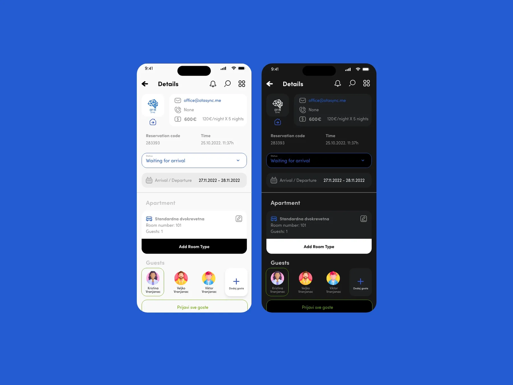
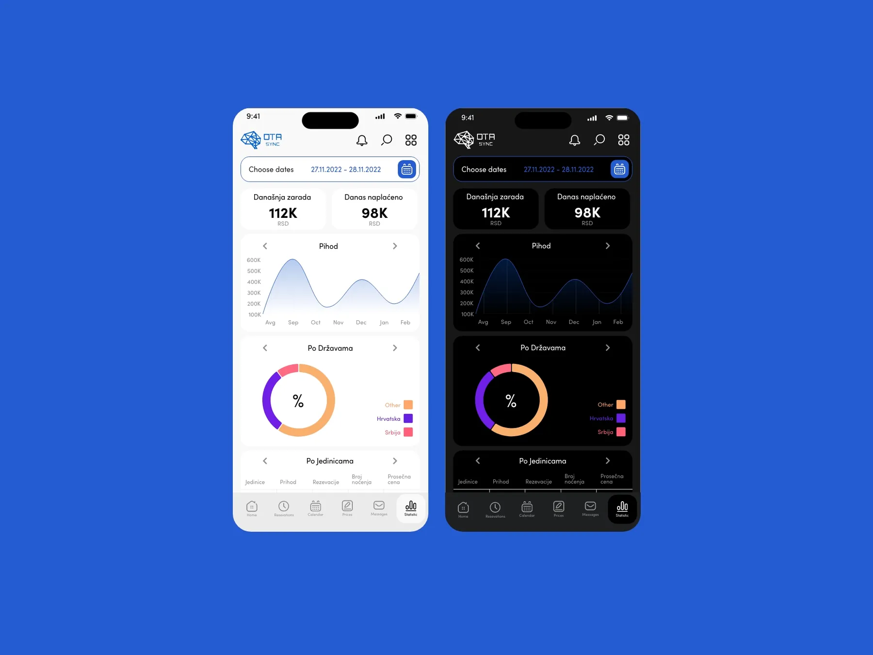
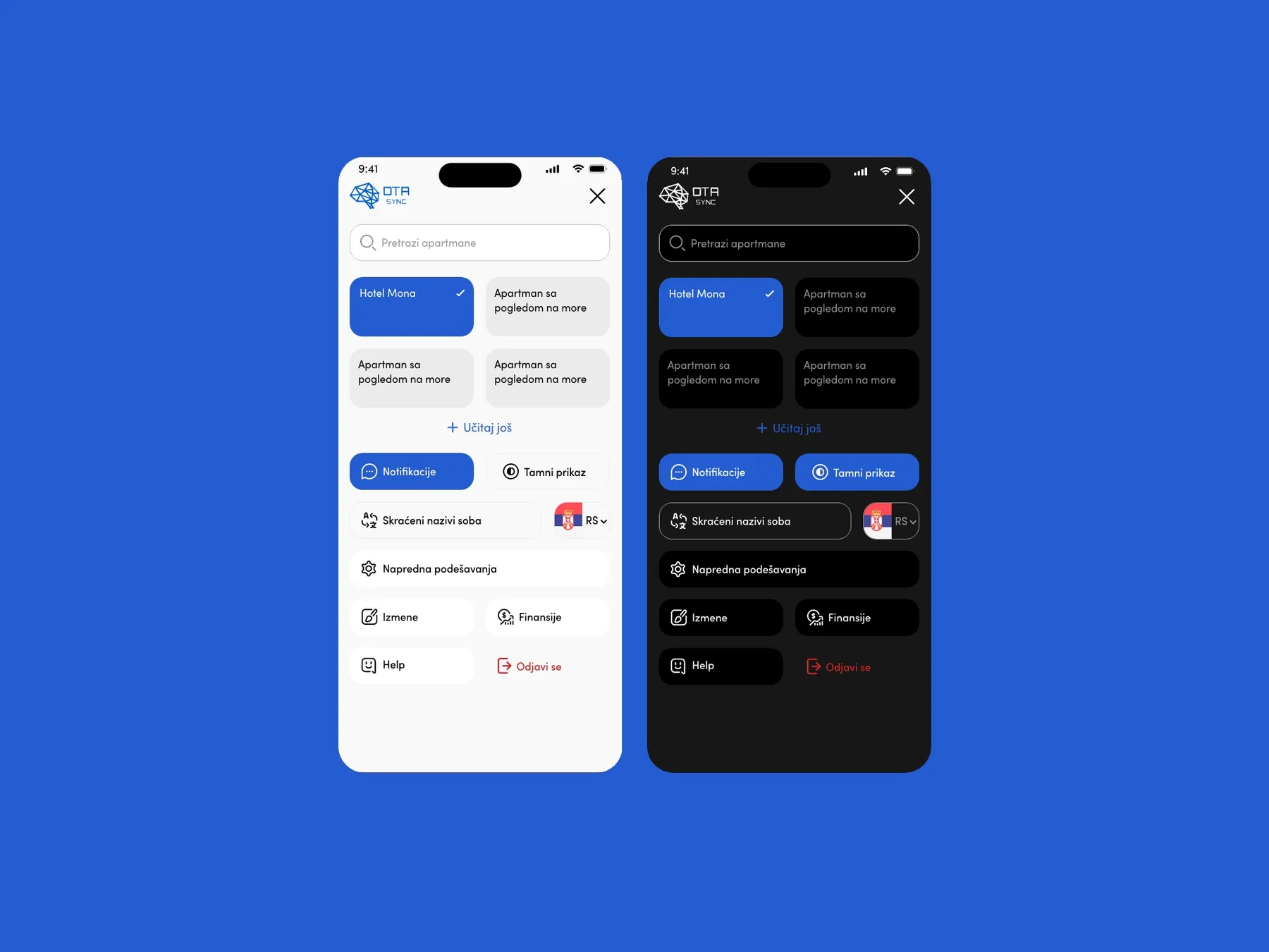
The product also included a native mobile app for hotel managers, designed in both light and dark mode. The app covered the full management workflow: daily dashboard with occupancy and revenue KPIs, reservations list with filter tabs, reservation detail view with guest management, statistics with revenue charts and country breakdowns, and a settings panel with property switching.